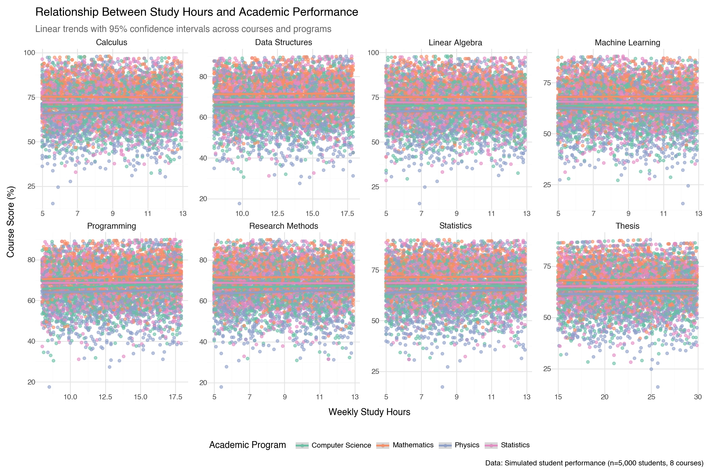
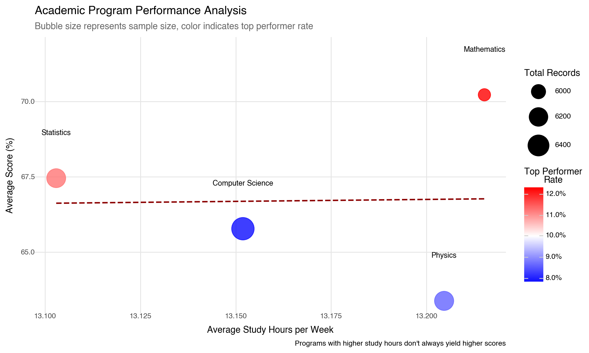
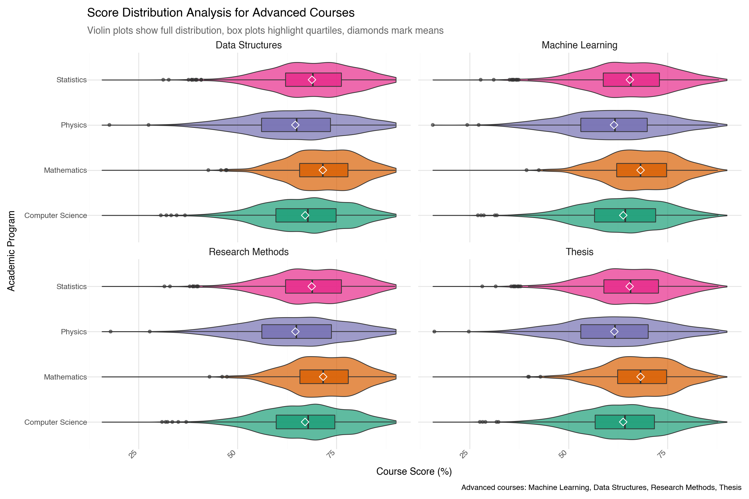
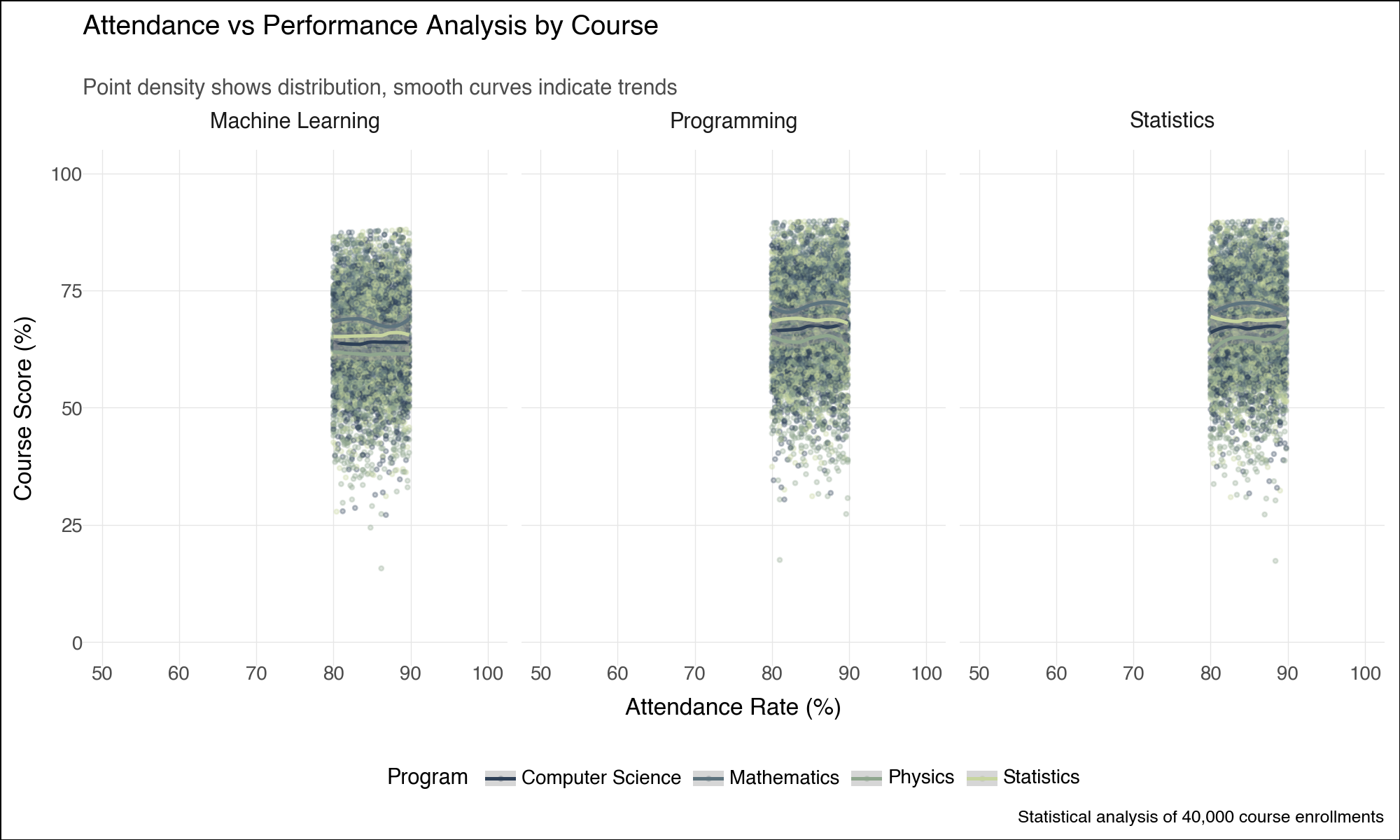
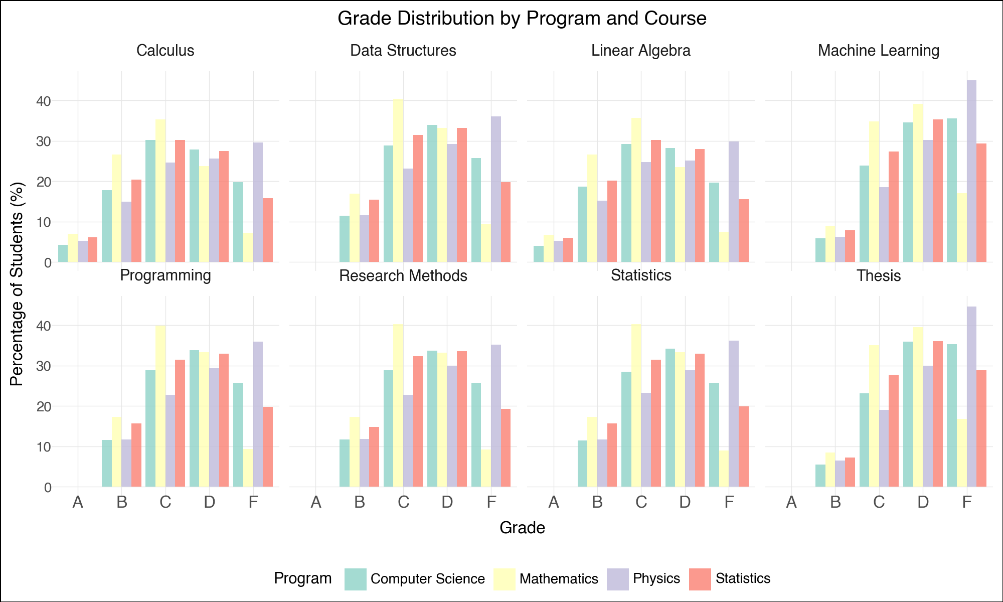
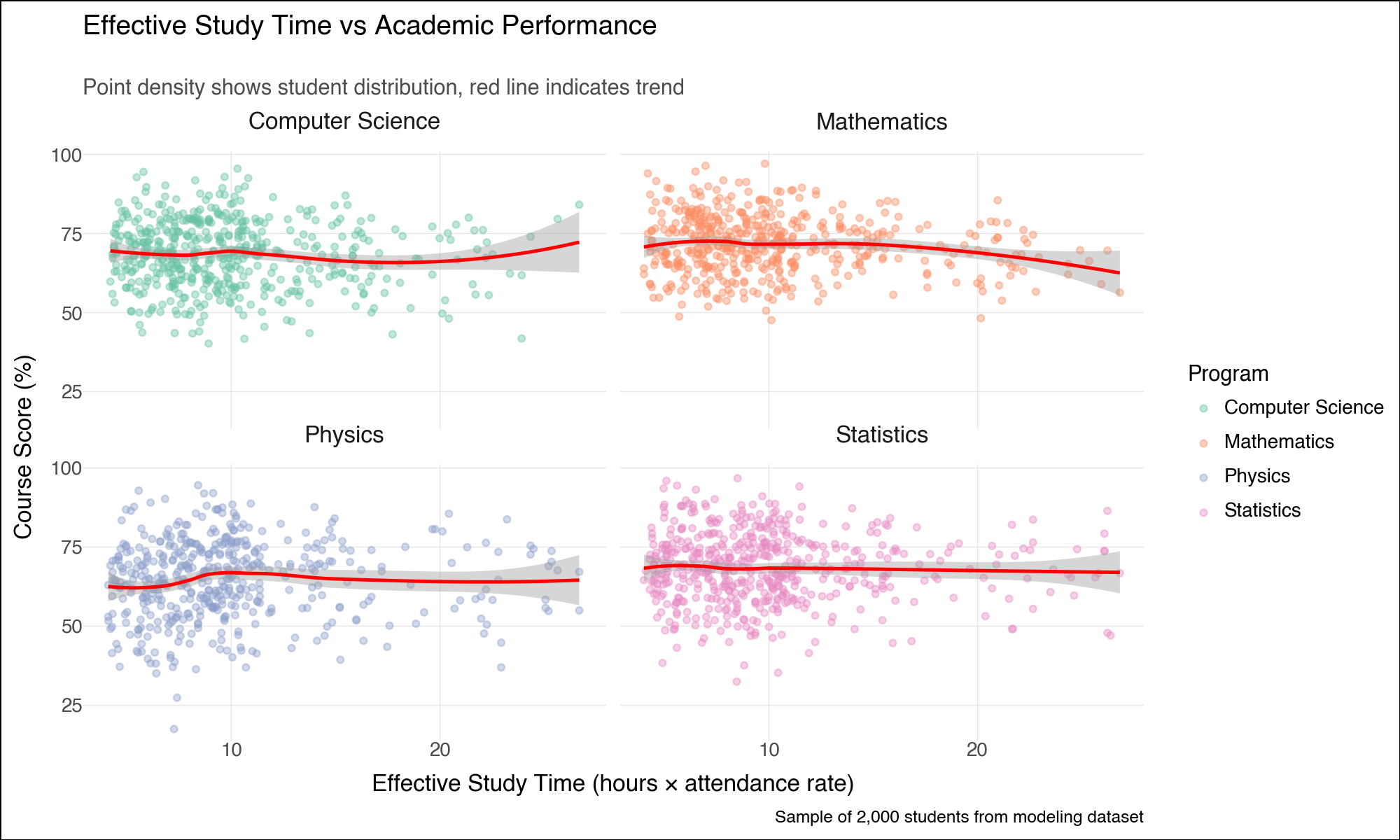
--- title: "Lightning-Fast Data Analysis: Polars and plotnine for Modern Python" date: 6 June, 2025 date-format: "DD MMM, YYYY" author: - name: Andrew Ellis url: https://github.com/awellis affiliation: Virtual Academy, Bern University of Applied Sciences affiliation-url: https://virtuelleakademie.ch orcid: 0000-0002-2788-936X categories: [Python, Polars, plotnine, data manipulation, visualization, performance, tutorial] format: html: code-fold: true code-tools: true code-summary: "Show the code" toc: true --- ## Why Polars + plotnine? ### The Performance Revolution: Polars - **Rust backend**: Memory-efficient and CPU-optimized operations- **Lazy evaluation**: Query optimization before execution - **Columnar processing**: Apache Arrow format for speed- **Parallel execution**: Automatic multi-threading- **Expressive API**: Clean, readable data manipulation syntax### The Grammar Advantage: plotnine - **Declarative syntax**: Describe what you want, not how to draw it- **Layered approach**: Build complex plots incrementally - **Consistent aesthetics**: Systematic approach to visual mapping- **Extensible**: Easy customization and theming- **Educational**: Matches R's ggplot2 for cross-language consistency## Setup and Data Preparation ```{python} #| message: false #| warning: false import polars as plimport numpy as npfrom plotnine import (import plotnine.optionsfrom datetime import datetime, timedeltaimport warnings# Configure plotnine for better output = (10 , 6 )= 100 'ignore' )# Ensure proper display in Quarto from IPython.display import displayimport matplotlib'Agg' ) # Use non-interactive backend # Display Polars version and configuration print (f"Polars version: { pl. __version__} " )print (f"Available threads: { pl. thread_pool_size()} " )``` ```{python} # Create a comprehensive educational dataset using Polars # This demonstrates Polars' syntax while creating realistic data 42 )# Generate base student data = 5000 = 8 = 6 # Create students DataFrame = pl.DataFrame({"student_id" : range (1 , n_students + 1 ),"age" : np.random.normal(22 , 2 , n_students).round ().astype(int ),"program" : np.random.choice(["Computer Science" , "Mathematics" , "Physics" , "Statistics" ], n_students),"entry_year" : np.random.choice([2020 , 2021 , 2022 , 2023 ], n_students),"study_mode" : np.random.choice(["Full-time" , "Part-time" ], n_students, p= [0.8 , 0.2 ])# Add realistic constraints using Polars expressions "age" ).clip(18 , 28 ).alias("age" ),# Generate GPA with program-based bias "program" ) == "Computer Science" )3.2 , 0.5 , n_students))"program" ) == "Mathematics" ) 3.4 , 0.4 , n_students))"program" ) == "Physics" )3.1 , 0.6 , n_students))3.3 , 0.5 , n_students))1.0 , 4.0 )round (2 )"gpa" )print ("Students DataFrame shape:" , students_df.shape)``` ```{python} # Create course performance data using a simple approach = ["Calculus" , "Linear Algebra" , "Statistics" , "Programming" , "Data Structures" , "Machine Learning" , "Research Methods" , "Thesis" ]# Create performance data manually to avoid cross join issues 42 )= []# Get student data as list for iteration = students_df.to_dicts()for student in student_records:for i, course in enumerate (courses):# Course difficulty multipliers if course in ["Machine Learning" , "Thesis" ]:= 20 = 1.6 elif course in ["Calculus" , "Linear Algebra" ]:= 22 = 2.0 else := 21 = 1.2 # Generate pseudo-random values based on student_id and course = (student["student_id" ] * 7 + i * 13 ) % 1000 # Calculate score = student["gpa" ] * base_multiplier= (seed_val / 100.0 - 5.0 ) * noise_factor= max (0 , min (100 , round (base_score + score_variation, 1 )))# Study hours based on course type if course in ["Programming" , "Data Structures" ]:= 8 + (seed_val % 100 ) / 10.0 elif course == "Thesis" := 15 + (seed_val % 150 ) / 10.0 else := 5 + (seed_val % 80 ) / 10.0 # Attendance = max (50 , min (100 , round (85 + (seed_val % 50 ) / 5.0 - 5.0 , 1 )))"student_id" : student["student_id" ],"program" : student["program" ],"gpa" : student["gpa" ],"course" : course,"semester" : i + 1 ,"score" : score,"study_hours" : round (study_hours, 1 ),"attendance" : attendance# Create Polars DataFrame from the records = pl.DataFrame(performance_records)print ("Performance DataFrame shape:" , performance_df.shape)``` ## Polars Data Manipulation Mastery ### 1. Basic Operations and Lazy Evaluation ```{python} # Demonstrate Polars' lazy evaluation = (# Switch to lazy mode filter (pl.col("score" ) >= 70 )"program" , "course" ])"score" ).mean().alias("avg_score" ),"study_hours" ).mean().alias("avg_study_hours" ),"attendance" ).mean().alias("avg_attendance" ),"n_students" )"avg_score" , descending= True )# Execute the lazy query = lazy_query.collect()print ("Top performing program-course combinations:" )10 )``` ```{python} # Advanced Polars expressions and window functions = (# Calculate percentile rank within each course "score" ).rank(method= "average" ).over("course" ).alias("course_rank" ),# Calculate student average score "score" ).mean().over("student_id" ).alias("student_avg" ),# Flag high performers (top 10% in course) - simplified calculation "score" ).rank(method= "average" , descending= True ).over("course" ) <= "score" ).count().over("course" ) * 0.1 ).cast(pl.Int64)).alias("top_performer" )filter (pl.col("semester" ) >= 4 ) # Focus on advanced courses print ("Student rankings with advanced metrics:" )``` ### 2. Complex Aggregations and Transformations ```{python} # Multi-level aggregations using Polars = ("program" )# Basic statistics "score" ).mean().alias("avg_score" ),"score" ).std().alias("std_score" ),"score" ).quantile(0.5 ).alias("median_score" ),# Advanced metrics "top_performer" ).sum ().alias("top_performers_count" ),"top_performer" ).mean().alias("top_performer_rate" ),# Study behavior "study_hours" ).mean().alias("avg_study_hours" ),"attendance" ).mean().alias("avg_attendance" ),# Count and range "total_records" ),"score" ).max () - pl.col("score" ).min ()).alias("score_range" )"avg_score" , descending= True )print ("Comprehensive program analysis:" )``` ```{python} # For correlation analysis, we'll use a simpler approach # Calculate correlations using pandas (since plotnine uses pandas anyway) import pandas as pd= []for program in performance_df["program" ].unique():= performance_df.filter (pl.col("program" ) == program).to_pandas()= program_data["score" ].corr(program_data["study_hours" ])= program_data["score" ].corr(program_data["attendance" ])"program" : program,"score_study_correlation" : round (score_study_corr, 3 ),"score_attendance_correlation" : round (score_attendance_corr, 3 )= pl.DataFrame(correlation_results)# Combine with program analysis = program_analysis.join(correlation_df, on= "program" )print (" \n Program analysis with correlations:" )``` ## Declarative Visualization with plotnine ### 3. Grammar of Graphics Implementation ```{python} #| fig-width: 12 #| fig-height: 8 #| output: true # Convert Polars to pandas for plotnine (plotnine expects pandas) = performance_df.to_pandas()# Configure plotnine for this specific plot import plotnine.options= (12 , 8 )# Create a sophisticated multi-faceted visualization = (= "study_hours" , y= "score" , color= "program" )) + = 0.6 , size= 1.5 ) + = "lm" , se= True , size= 1.2 ) + "course" , ncol= 4 , scales= "free" ) + type = "qual" , palette= "Set2" ) + = "Relationship Between Study Hours and Academic Performance" ,= "Linear trends with 95 % c onfidence intervals across courses and programs" ,= "Weekly Study Hours" ,= "Course Score (%)" ,= "Academic Program" ,= "Data: Simulated student performance (n=5,000 students, 8 courses)" + + = element_text(size= 14 , weight= "bold" ),= element_text(size= 11 , color= "#666666" ),= element_text(size= 10 , weight= "bold" ),= "bottom" # Display the plot ``` ### 4. Advanced Layered Visualizations ```{python} #| fig-width: 10 #| fig-height: 6 #| output: true # Configure plotnine for this plot = (10 , 6 )# Aggregate data for program comparison = program_analysis.to_pandas()# Create a sophisticated comparison plot = (= "avg_study_hours" , y= "avg_score" )) + # Add confidence ellipses based on standard deviation = "total_records" , color= "top_performer_rate" ), alpha= 0.8 ) + # Add program labels = "program" ), nudge_y= 1.5 , size= 9 , fontweight= "bold" ) + # Add trend line = "lm" , color= "darkred" , linetype= "dashed" , se= False ) + # Customize scales = "Total Records" ,range = (8 , 15 ),= guide_legend(override_aes= {"alpha" : 1 })+ = "Top Performer \n Rate" ,= "blue" , mid= "white" , high= "red" ,= 0.1 ,= lambda breaks: [f" { x:.1%} " for x in breaks]+ # Elegant theming = "Academic Program Performance Analysis" ,= "Bubble size represents sample size, color indicates top performer rate" ,= "Average Study Hours per Week" ,= "Average Score (%)" ,= "Programs with higher study hours don't always yield higher scores" + + = element_text(size= 14 , weight= "bold" ),= element_text(size= 11 , color= "#666666" ),= "right" ,= element_blank()# Display the plot ``` ### 5. Distribution Analysis with Multiple Geometries ```{python} #| fig-width: 12 #| fig-height: 8 #| output: true # Focus on advanced courses for distribution analysis = performance_pd["course" ].isin(["Machine Learning" , "Data Structures" , "Research Methods" , "Thesis" ])# Configure plotnine for this plot = (12 , 8 )# Create comprehensive distribution plot = (= "program" , y= "score" , fill= "program" )) + # Violin plots for distribution shape = 0.7 , trim= False ) + # Box plots for summary statistics = 0.3 , alpha= 0.8 , outlier_alpha= 0.6 ) + # Add mean points = np.mean, geom= "point" , size= 3 , color= "white" , shape= "D" ) + # Facet by course "course" , ncol= 2 ) + # Color scheme type = "qual" , palette= "Dark2" ) + # Coordinate system + # Labels and theme = "Score Distribution Analysis for Advanced Courses" ,= "Violin plots show full distribution, box plots highlight quartiles, diamonds mark means" ,= "Academic Program" ,= "Course Score (%)" ,= "Program" ,= "Advanced courses: Machine Learning, Data Structures, Research Methods, Thesis" + + = element_text(size= 14 , weight= "bold" ),= element_text(size= 11 , color= "#666666" ),= element_text(size= 11 , weight= "bold" ),= "none" , # Remove legend since x-axis shows programs = element_text(angle= 45 , hjust= 1 )# Display the plot ``` ## Performance Comparison: Polars vs Pandas ### 6. Speed Benchmarking ```{python} import timeimport pandas as pd# Create larger dataset for meaningful comparison = 50000 = pl.DataFrame({"student_id" : range (1 , large_n + 1 ),"program" : np.random.choice(["CS" , "Math" , "Physics" , "Stats" ], large_n),"score" : np.random.normal(75 , 15 , large_n),"study_hours" : np.random.gamma(3 , 2 , large_n),"semester" : np.random.choice(range (1 , 9 ), large_n)# Convert to pandas for comparison = large_students.to_pandas()print (f"Dataset size: { large_students. shape[0 ]:,} rows" )``` ```{python} # Benchmark complex aggregation operations def benchmark_polars():= time.time()= ("program" , "semester" ])"score" ).mean().alias("avg_score" ),"score" ).std().alias("std_score" ),"study_hours" ).mean().alias("avg_hours" ),"score" ).quantile(0.9 ).alias("score_90th" ),"count" )filter (pl.col("count" ) >= 100 )"program" , "semester" ])= time.time()return end_time - start_time, result.shape[0 ]def benchmark_pandas():= time.time()= ("program" , "semester" ])"score" : ["mean" , "std" , lambda x: x.quantile(0.9 )],"study_hours" : "mean" ,"student_id" : "count" # Flatten column names = ["_" .join(col).strip() if col[1 ] else col[0 ] for col in result.columns]= result[result.iloc[:, - 1 ] >= 100 ] # Filter by count = time.time()return end_time - start_time, result.shape[0 ]# Run benchmarks = benchmark_polars()= benchmark_pandas()print (f"Polars: { polars_time:.4f} seconds ( { polars_rows} result rows)" )print (f"Pandas: { pandas_time:.4f} seconds ( { pandas_rows} result rows)" )print (f"Speedup: { pandas_time/ polars_time:.2f} x faster with Polars" )``` ### 7. Memory Usage Analysis ```{python} # Memory usage comparison print ("Memory usage comparison:" )print (f"Polars DataFrame: { large_students. estimated_size('mb' ):.2f} MB" )print (f"Pandas DataFrame: { large_students_pd. memory_usage(deep= True ). sum () / 1024 ** 2 :.2f} MB" )# Show data types efficiency print (" \n Data types:" )print ("Polars dtypes:" )for col, dtype in zip (large_students.columns, large_students.dtypes):print (f" { col} : { dtype} " )print (" \n Pandas dtypes:" )for col, dtype in large_students_pd.dtypes.items():print (f" { col} : { dtype} " )``` ## Advanced plotnine Techniques ### 8. Custom Themes and Statistical Layers ```{python} #| fig-width: 10 #| fig-height: 6 #| output: true # Configure plotnine for this plot = (10 , 6 )# Create a custom theme for academic publications = theme_minimal() + theme(= element_text(size= 14 , weight= "bold" , margin= {"b" : 20 }),= element_text(size= 11 , color= "#4d4d4d" , margin= {"b" : 15 }),= element_text(size= 12 , weight= "bold" ),= element_text(size= 10 ),= element_text(size= 11 , weight= "bold" ),= element_text(size= 10 ),= element_text(size= 11 , weight= "bold" , margin= {"b" : 10 }),= element_line(color= "#e6e6e6" , size= 0.5 ),= element_blank(),= element_rect(fill= "white" ),= element_rect(fill= "white" )# Advanced statistical visualization = (filter (pl.col("course" ).is_in(["Programming" , "Machine Learning" , "Statistics" ]))= (= "attendance" , y= "score" )) + # Add points with transparency to show density = "program" ), alpha= 0.3 , size= 0.8 ) + # Add smooth trend lines = "program" ), method= "loess" , se= True ) + # Facet by course "course" , ncol= 3 ) + # Custom color palette = ["#2E4057" , "#5D737E" , "#8FA68E" , "#C7D59F" ],= "Program" + # Coordinate limits 50 , 100 ) + 0 , 100 ) + # Labels = "Attendance vs Performance Analysis by Course" ,= "Point density shows distribution, smooth curves indicate trends" ,= "Attendance Rate (%)" ,= "Course Score (%)" ,= "Statistical analysis of 40,000 course enrollments" + # Apply custom theme + = "bottom" )# Display the plot ``` ## Polars-plotnine Integration Best Practices ### 9. Efficient Data Pipeline ```{python} # Demonstrate efficient Polars → plotnine workflow def create_analysis_pipeline(data: pl.DataFrame, analysis_type: str ):""" Efficient pipeline that processes data in Polars and visualizes with plotnine """ if analysis_type == "performance_trends" :# Complex Polars aggregation = ("score" ) >= 90 ).then(pl.lit("A" ))"score" ) >= 80 ).then(pl.lit("B" )) "score" ) >= 70 ).then(pl.lit("C" ))"score" ) >= 60 ).then(pl.lit("D" ))"F" )).alias("grade" )"course" , "program" , "grade" ])"student_count" ),"study_hours" ).mean().alias("avg_study_hours" )"student_count" ).sum ().over(["course" , "program" ]).alias("total_students" )"student_count" ) / pl.col("total_students" ) * 100 ).alias("percentage" )filter (pl.col("total_students" ) >= 50 ) # Sufficient sample size # Convert to pandas only for plotting = processed.to_pandas()# Configure plotnine for this plot = (10 , 6 )# Create visualization = (= "grade" , y= "percentage" , fill= "program" )) + = "dodge" , alpha= 0.8 ) + "course" , ncol= 4 ) + type = "qual" , palette= "Set3" ) + = "Grade Distribution by Program and Course" ,= "Grade" , y= "Percentage of Students (%)" ,= "Program" + + = element_text(size= 12 , weight= "bold" ),= "bottom" return processed, pelse :raise ValueError ("Unknown analysis type" )# Execute pipeline = create_analysis_pipeline(performance_df, "performance_trends" )print ("Processed data shape:" , grade_analysis.shape)# Display the plot ``` ## Real-World Applications ### 10. Educational Data Science Workflow ```{python} # Simulate a complete educational analytics workflow # 1. Data Quality Assessment with Polars # Create quality report with separate operations to avoid mixing agg types = performance_df.null_count()= performance_df.select(["score" ).min ().alias("score_min" ),"score" ).max ().alias("score_max" ),"score" ).mean().alias("score_mean" ),= performance_df.select(["score" ) < 0 ).sum ().alias("negative_scores" ),"score" ) > 100 ).sum ().alias("invalid_scores" ),"study_hours" ) < 0 ).sum ().alias("negative_hours" ),print ("Data Quality Report:" )print ("Null counts:" )print (null_counts)print (" \n Statistical summary:" )print (stats_summary)print (" \n Quality flags:" )print (quality_flags)``` ```{python} # 2. Predictive modeling preparation # Check what columns we have available print ("Performance DataFrame columns:" , performance_df.columns)# Create modeling features directly from performance_df (which already includes key student data) = (# Feature engineering - simplified approach "score" ).shift(1 , fill_value= 0 ).over("student_id" ).alias("previous_score" ),"study_hours" ).mean().over("student_id" ).alias("avg_study_hours_student" ),"attendance" ) >= 85 ).alias("high_attendance" ),# Target encoding - course difficulty (average score for each course) "score" ).mean().over("course" ).alias("course_difficulty" ),# Interaction features "study_hours" ) * pl.col("attendance" ) / 100.0 ).alias("effective_study_time" ),# Course progress indicator "semester" ).rank().over("student_id" ).alias("course_sequence" )filter (pl.col("score" ).is_not_null()) # Remove missing values for modeling print ("Modeling dataset shape:" , modeling_data.shape)print ("Features available for modeling:" )print (modeling_data.columns)``` ```{python} #| fig-width: 12 #| fig-height: 6 #| output: true # 3. Final comprehensive visualization = modeling_data.to_pandas()# Configure plotnine for this plot = (12 , 6 )= (2000 ), aes(x= "effective_study_time" , y= "score" )) + # Use points with alpha for density visualization = "program" ), alpha= 0.4 , size= 1.5 ) + # Overlay trend line = "red" , method= "loess" ) + # Facet by program "program" , ncol= 2 ) + # Color scale for points type = "qual" , palette= "Set2" , name= "Program" ) + # Labels = "Effective Study Time vs Academic Performance" ,= "Point density shows student distribution, red line indicates trend" ,= "Effective Study Time (hours × attendance rate)" ,= "Course Score (%)" ,= "Sample of 2,000 students from modeling dataset" + # Professional theme + = element_text(size= 12 , weight= "bold" ),= "right" # Display the plot ``` ## Key Takeaways and Best Practices ### Performance Benefits 1. **Polars advantages**: 2-10x faster than pandas for most operations2. **Memory efficiency**: Lower memory footprint with optimized data types3. **Lazy evaluation**: Query optimization before execution4. **Parallel processing**: Automatic multi-threading### Visualization Excellence 1. **Grammar of graphics**: Systematic approach to building complex visualizations2. **Layer composition**: Build plots incrementally for clarity3. **Consistent aesthetics**: Professional appearance with minimal code4. **Cross-platform**: Same syntax as R's ggplot2### Integration Strategy 1. **Data processing in Polars**: Leverage speed for heavy computations2. **Visualization in plotnine**: Convert to pandas only when plotting3. **Memory management**: Process in chunks for very large datasets4. **Type consistency**: Ensure proper data types throughout pipeline### Educational Applications - **Performance analytics**: Fast processing of large student datasets- **Interactive exploration**: Quick iteration during analysis- **Publication-ready plots**: Professional visualizations for research- **Reproducible workflows**: Clear, readable data science pipelines## Conclusion - **Polars** delivers exceptional performance for data manipulation with an intuitive API- **plotnine** provides the grammar of graphics for systematic visualization- **Together** they enable fast, elegant, and reproducible data science workflows- Process large institutional datasets efficiently- Create publication-quality visualizations- Build reproducible analytical pipelines - Scale analyses as data grows